
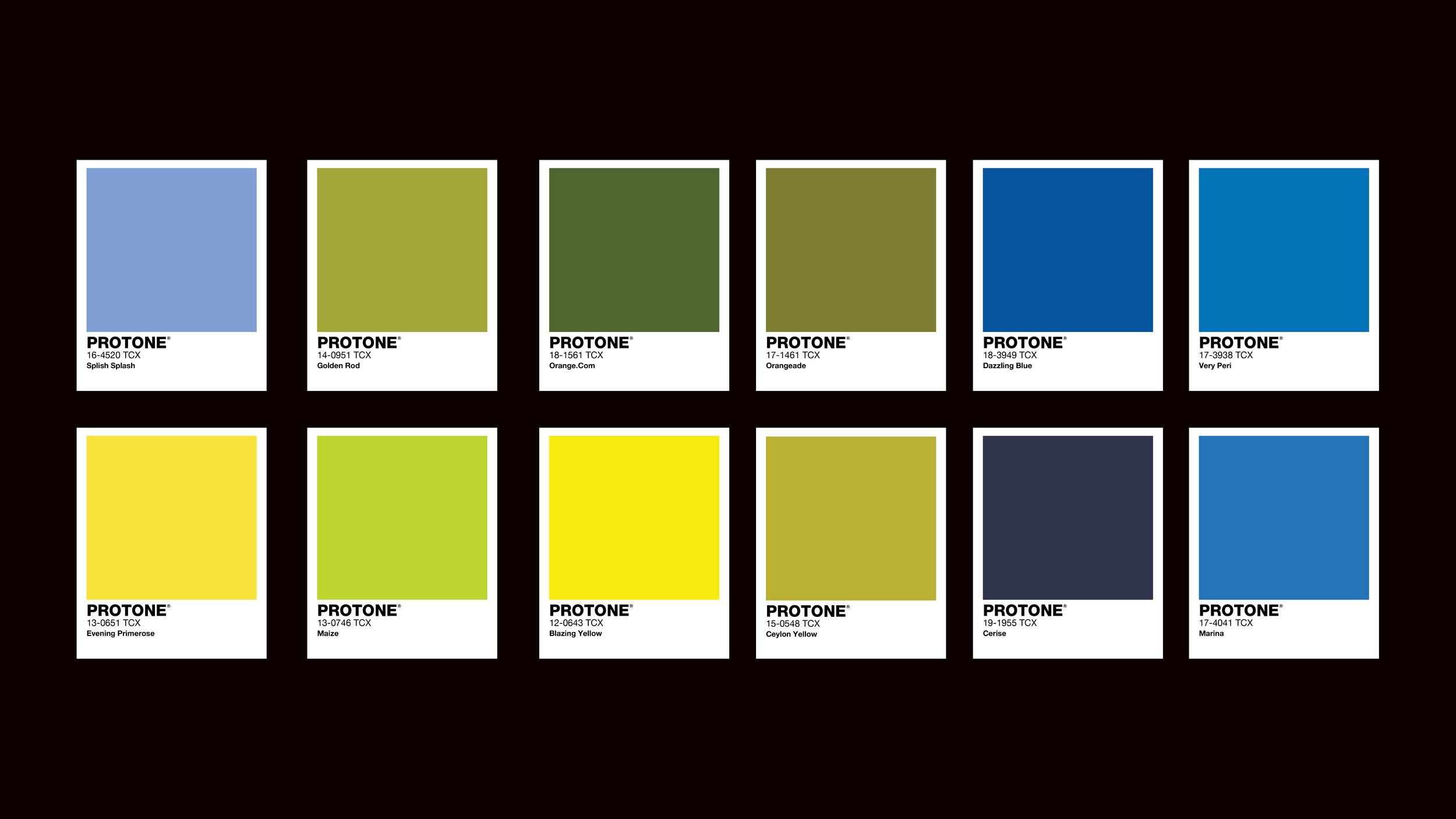
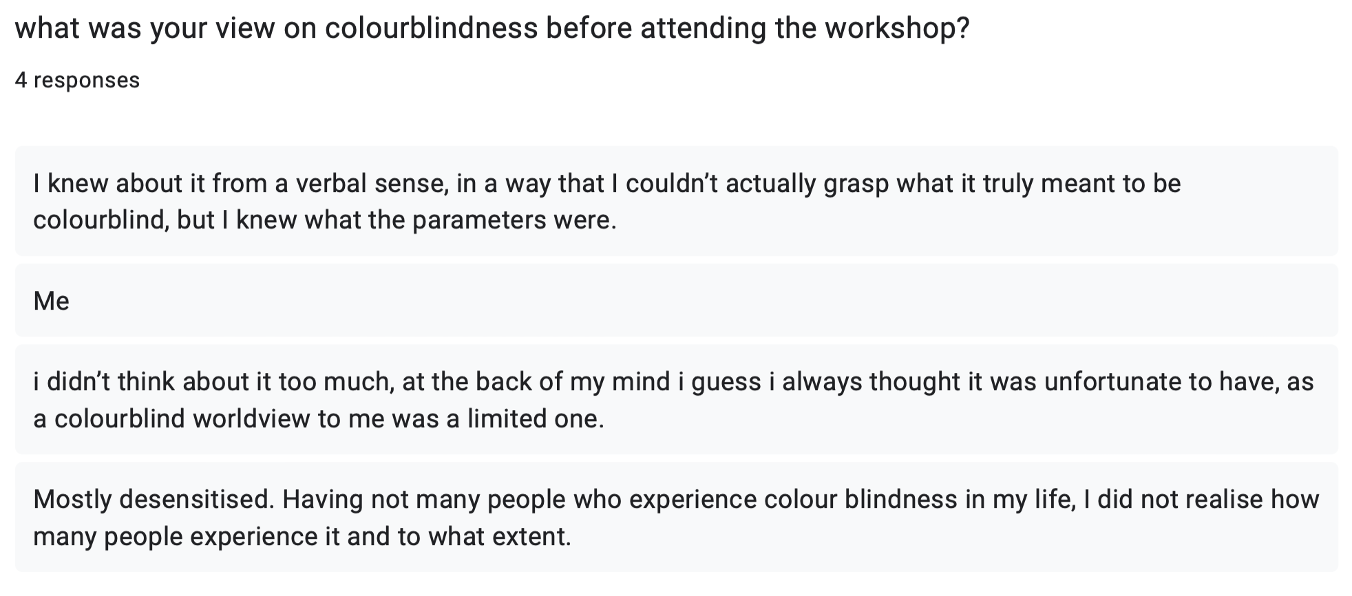
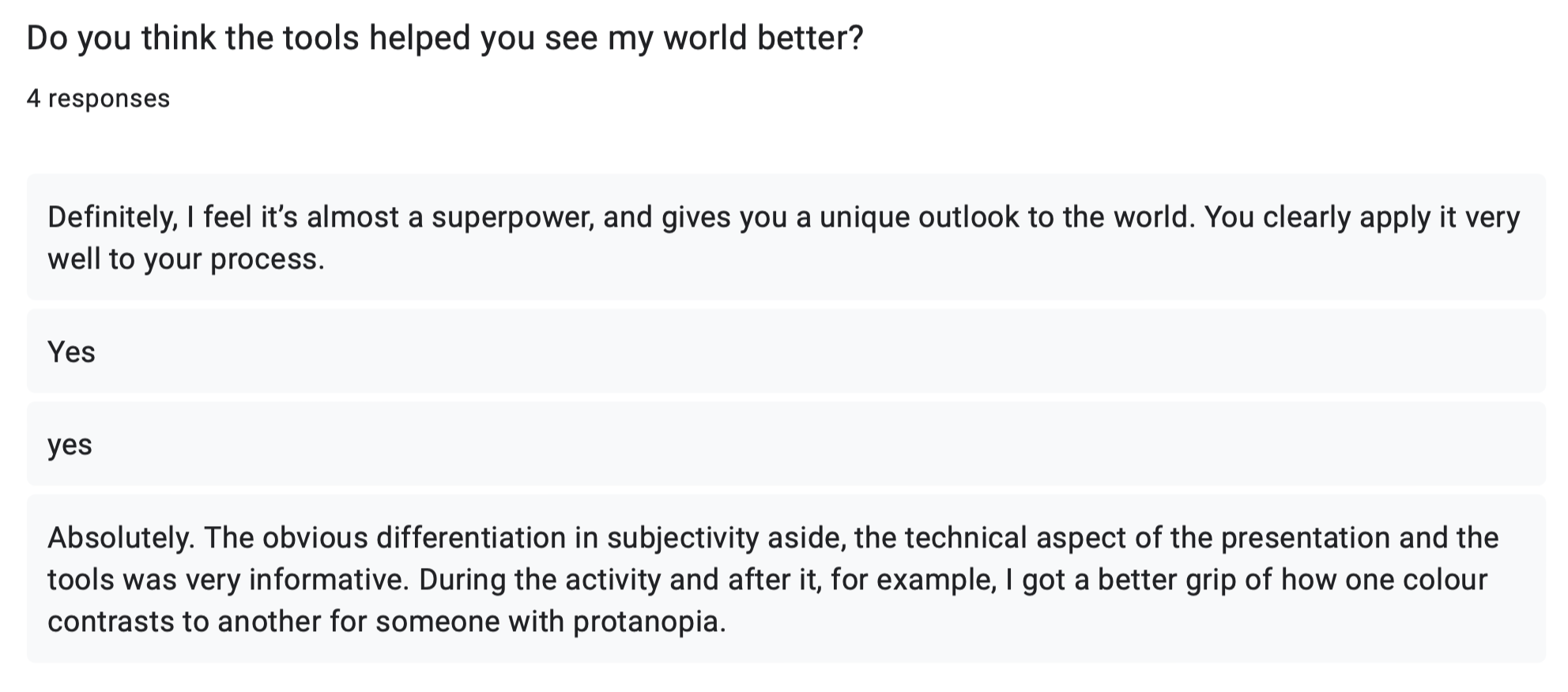
I created tools to celebrate how people with protanopia view the world, tools that help designers, photographers and filmmakers.
“PROTONE” is the Pantone of protanopia. It may be a limited colour palette. But it’s enough.
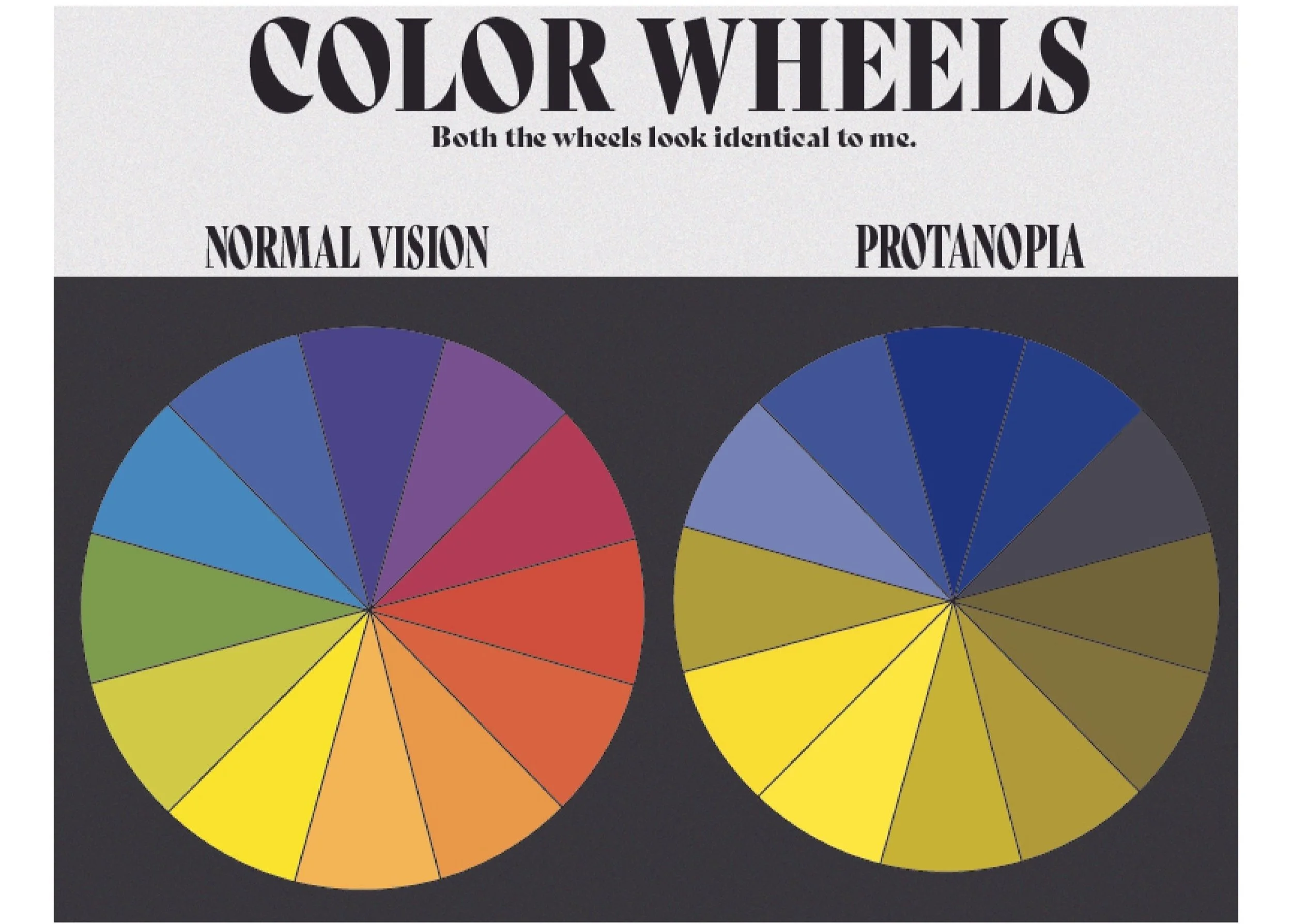
The world revolves around standard colour vision, which can make things confusing for colourblind people. As a strong proton colourblind designer/photographer/filmmaker I tend to centre my work to the normal vision which also doesn’t always end well.
I said “fuck that”- this is all about how I see the world.
These are my colours.
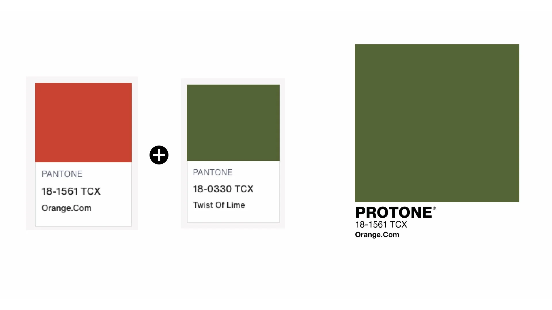
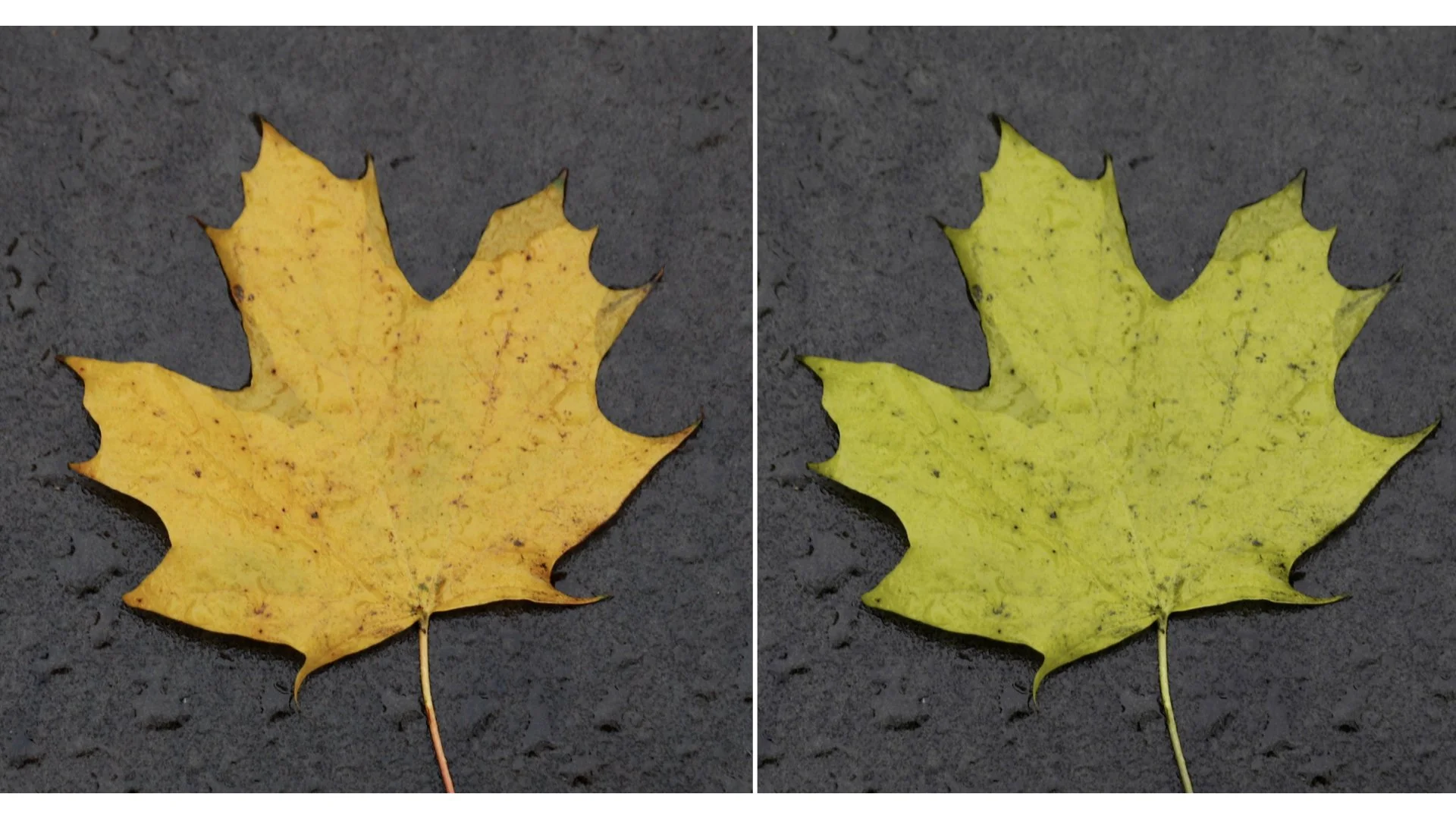
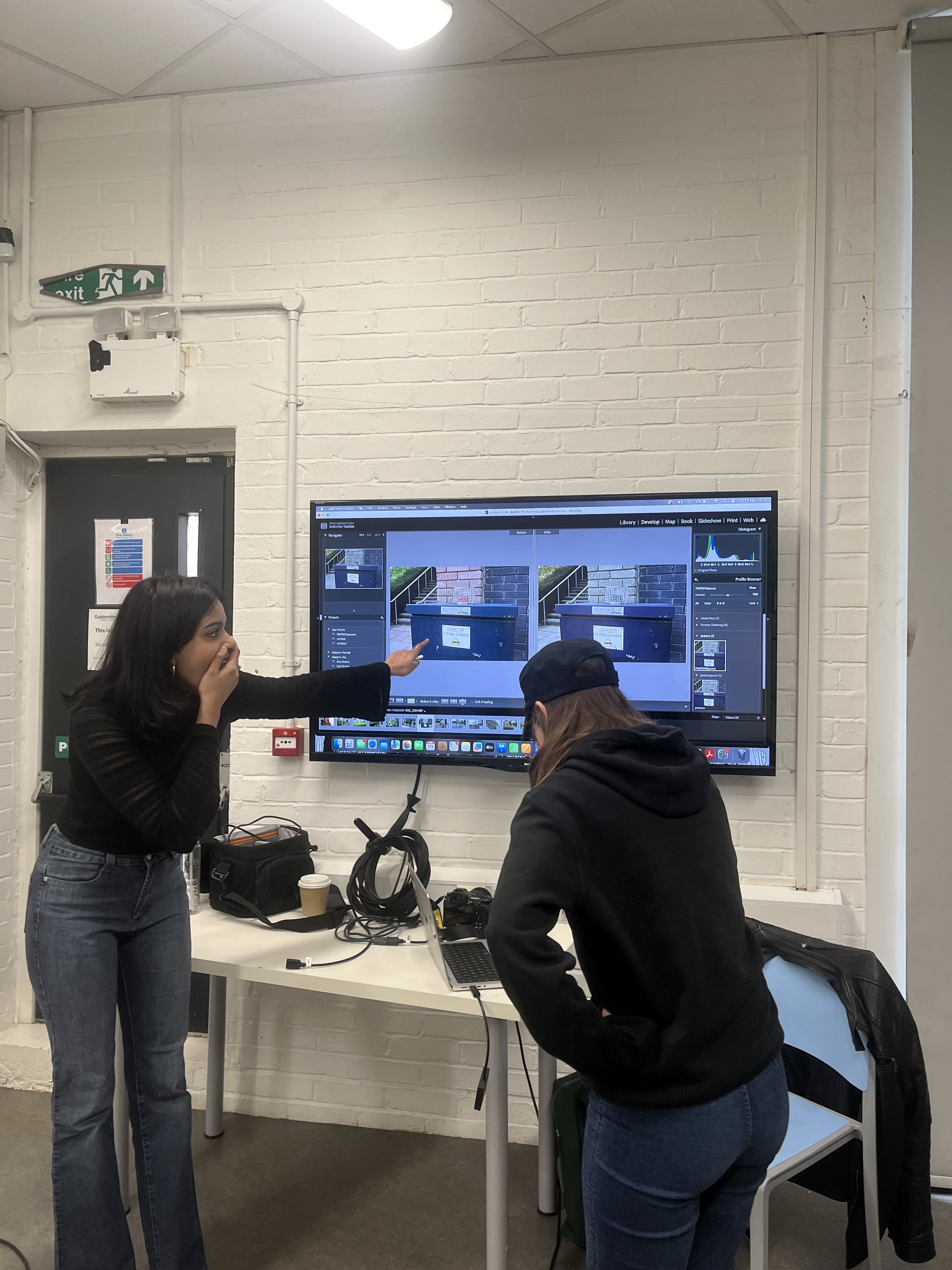
“twist of lime” is how “orange.com” looks to me in a non-colourblind viewpoint.
In PROTONE - “orange.com” is shown as twist of lime as the new normal.
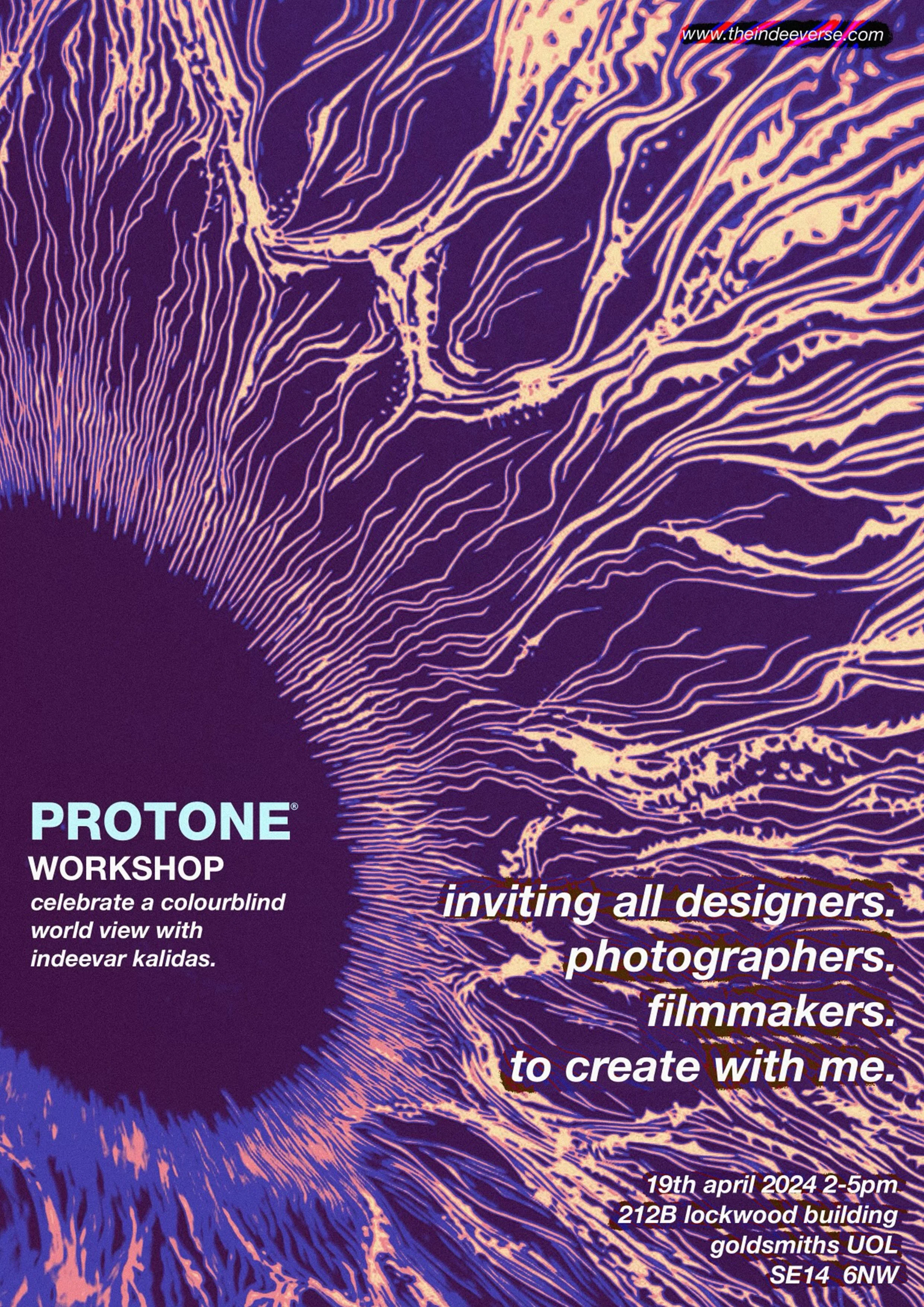
WORKSHOP

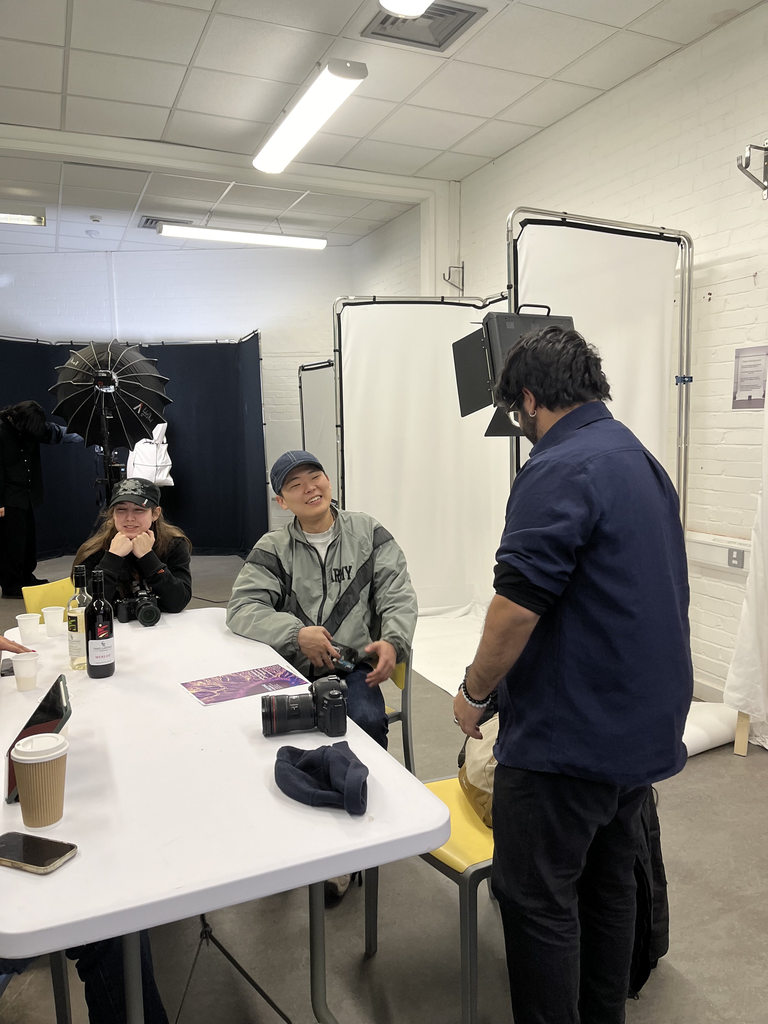
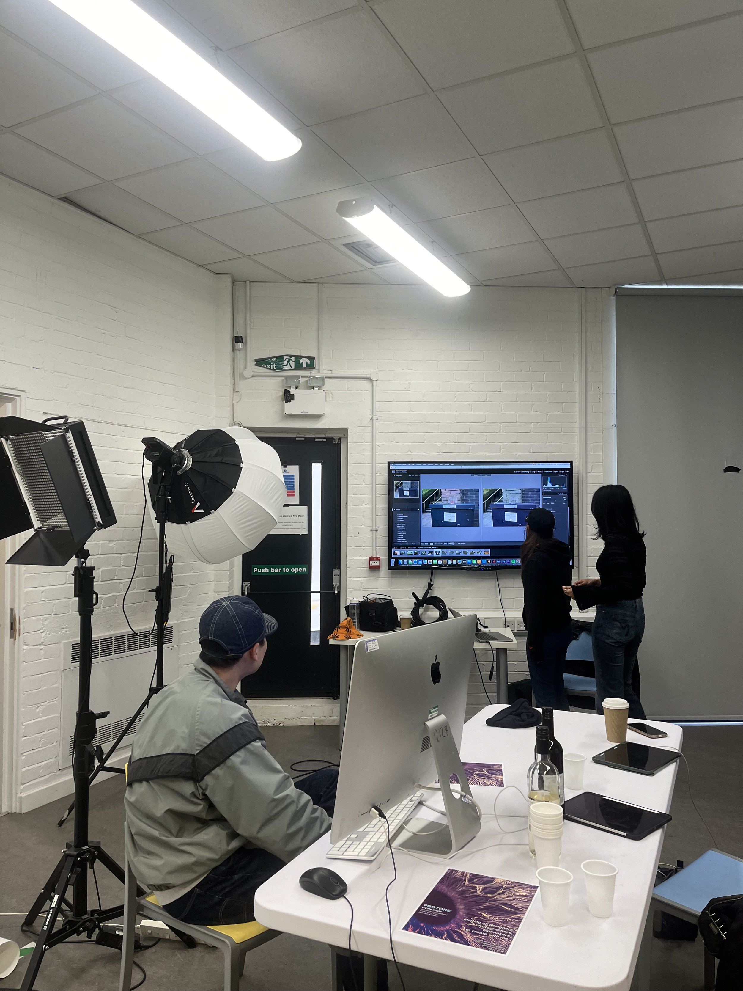
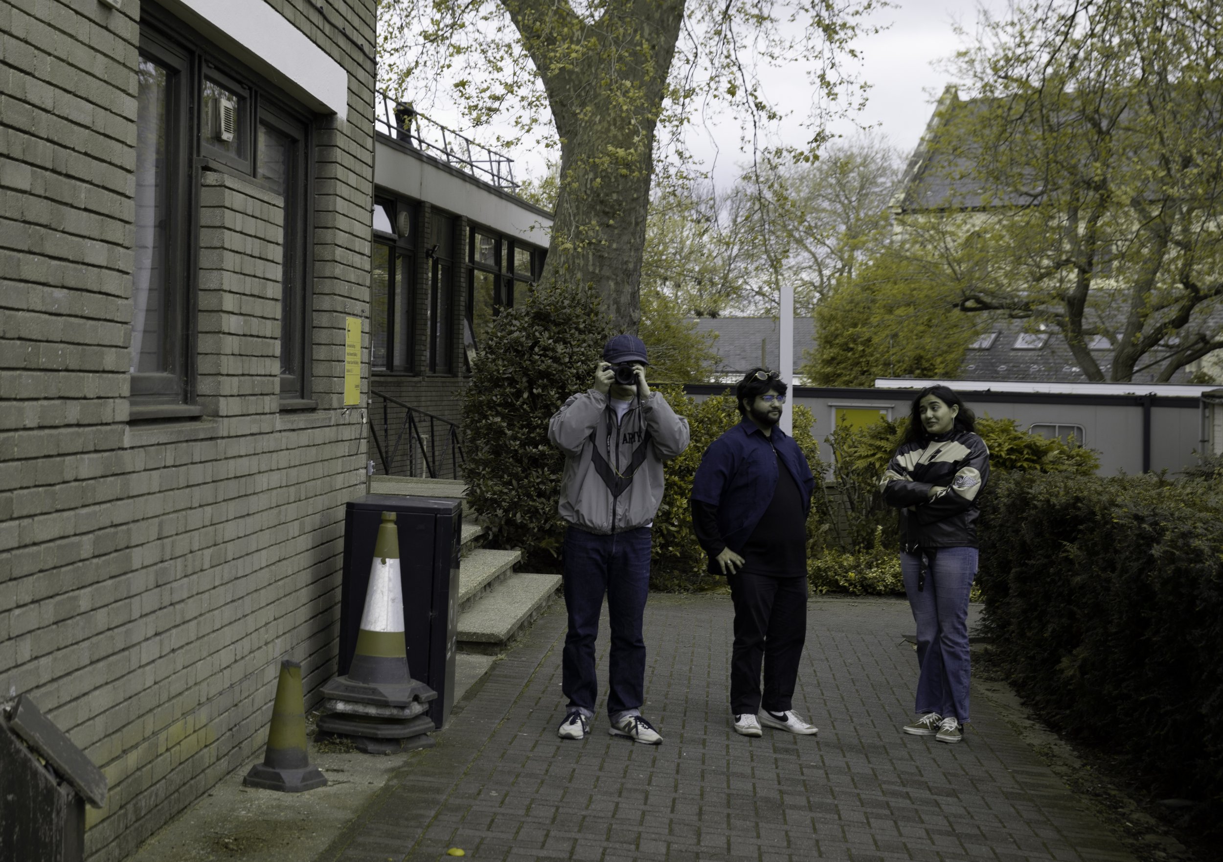
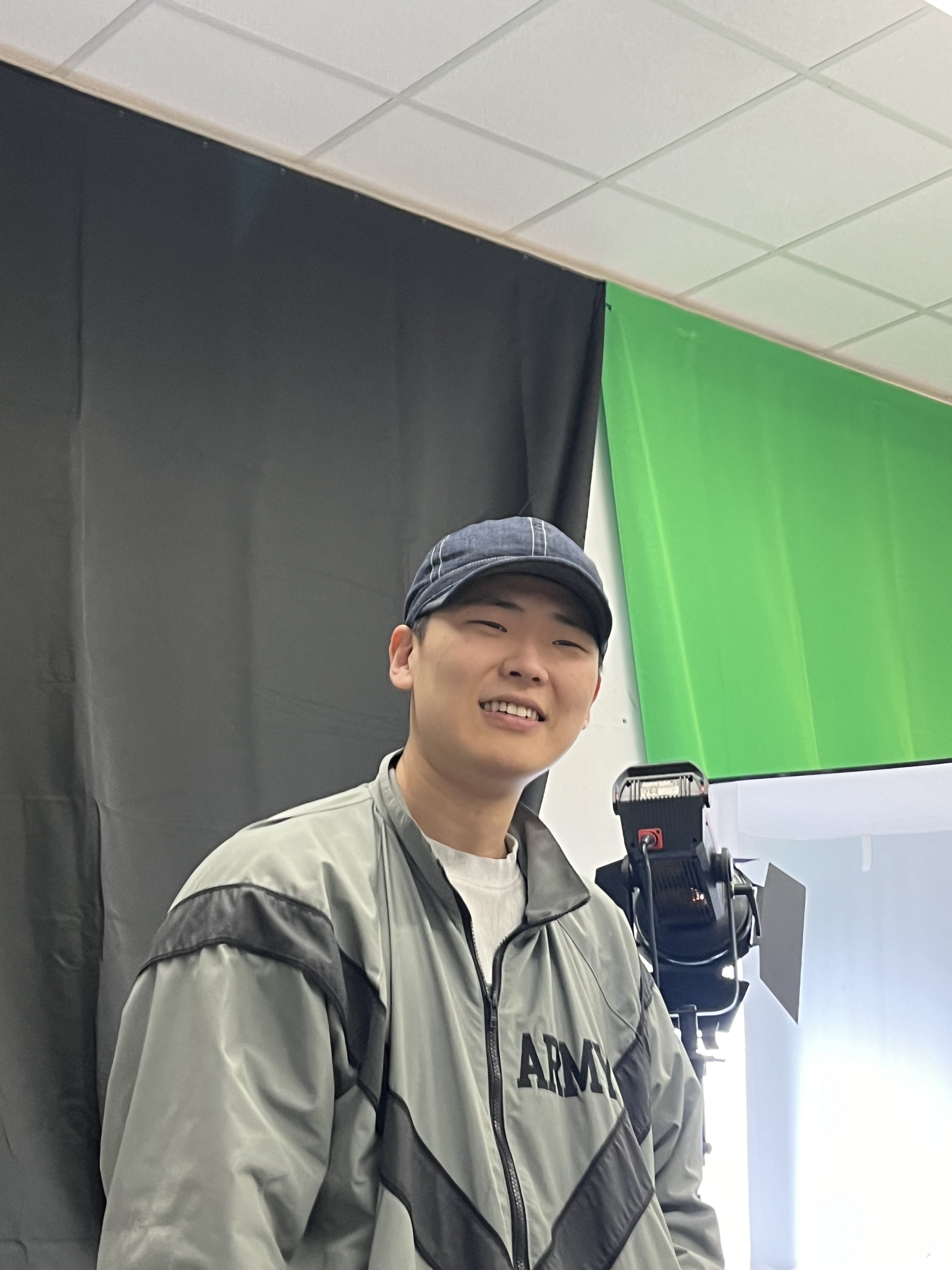
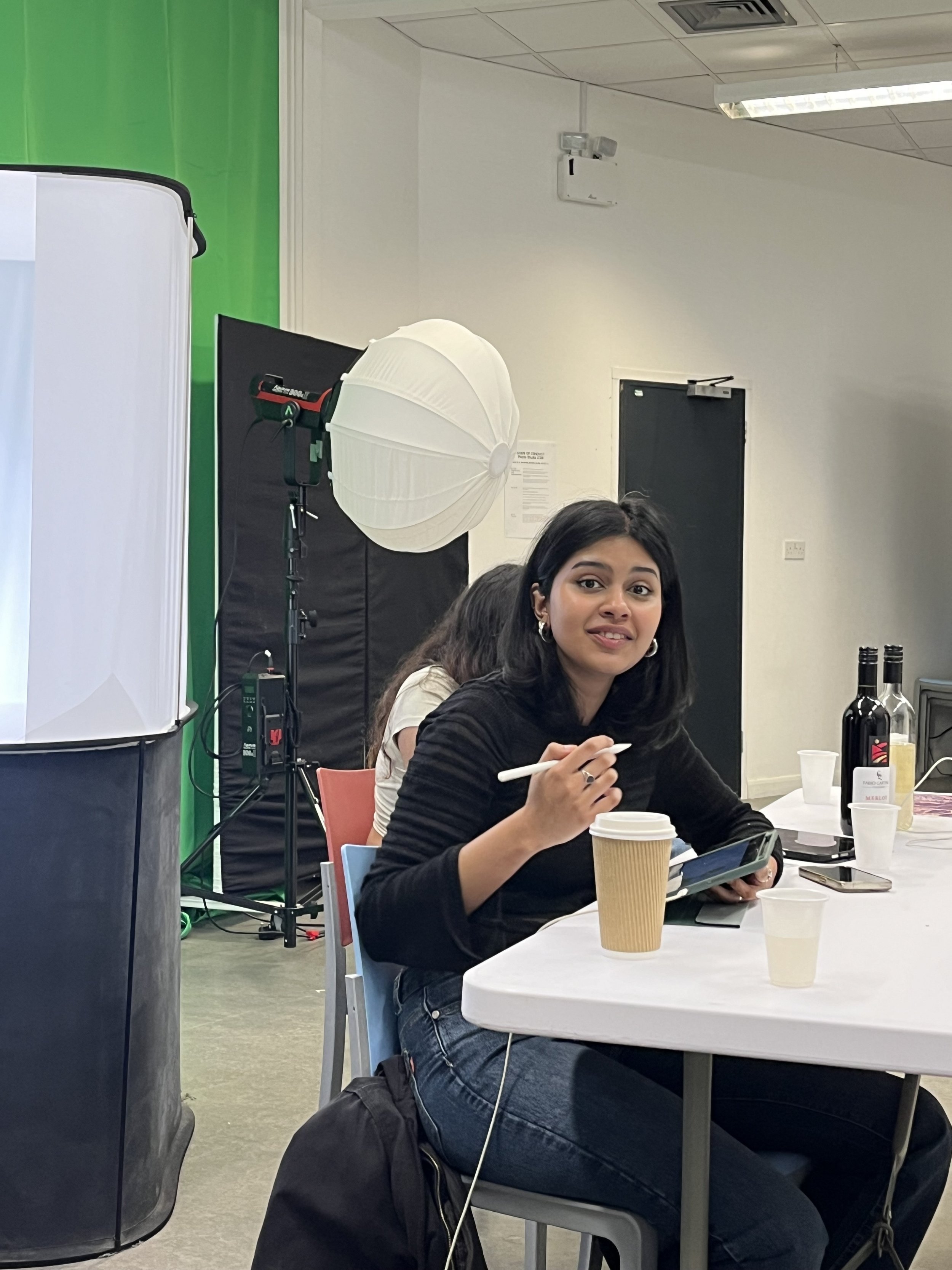
Workshop activity
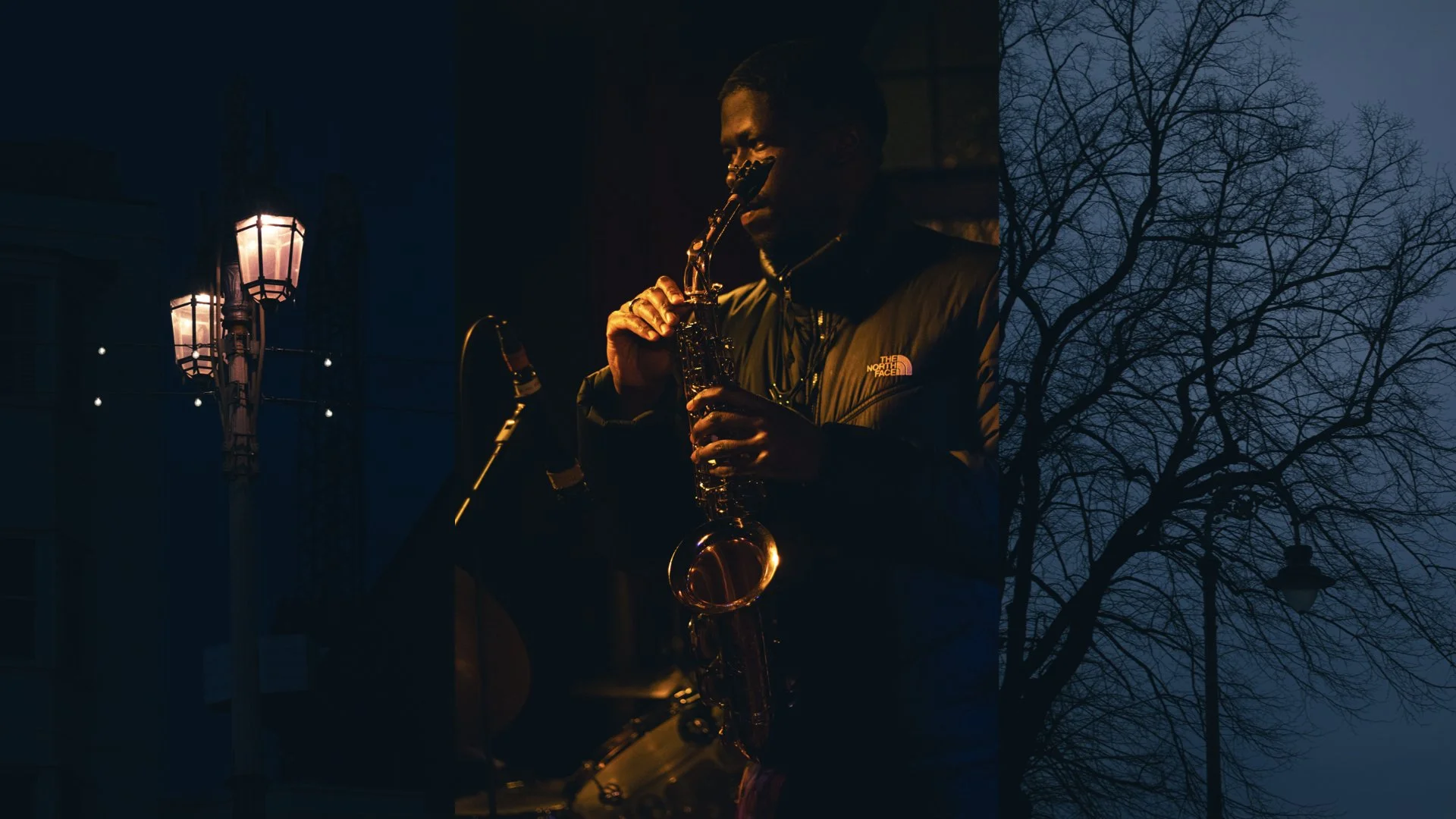
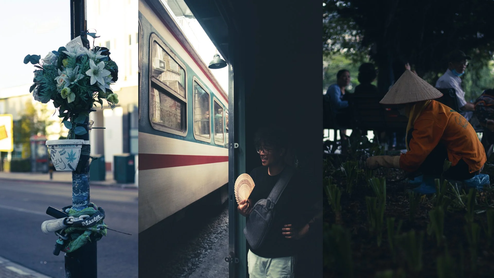
“documenting the everyday”
Go around the given areas and capture the everyday.
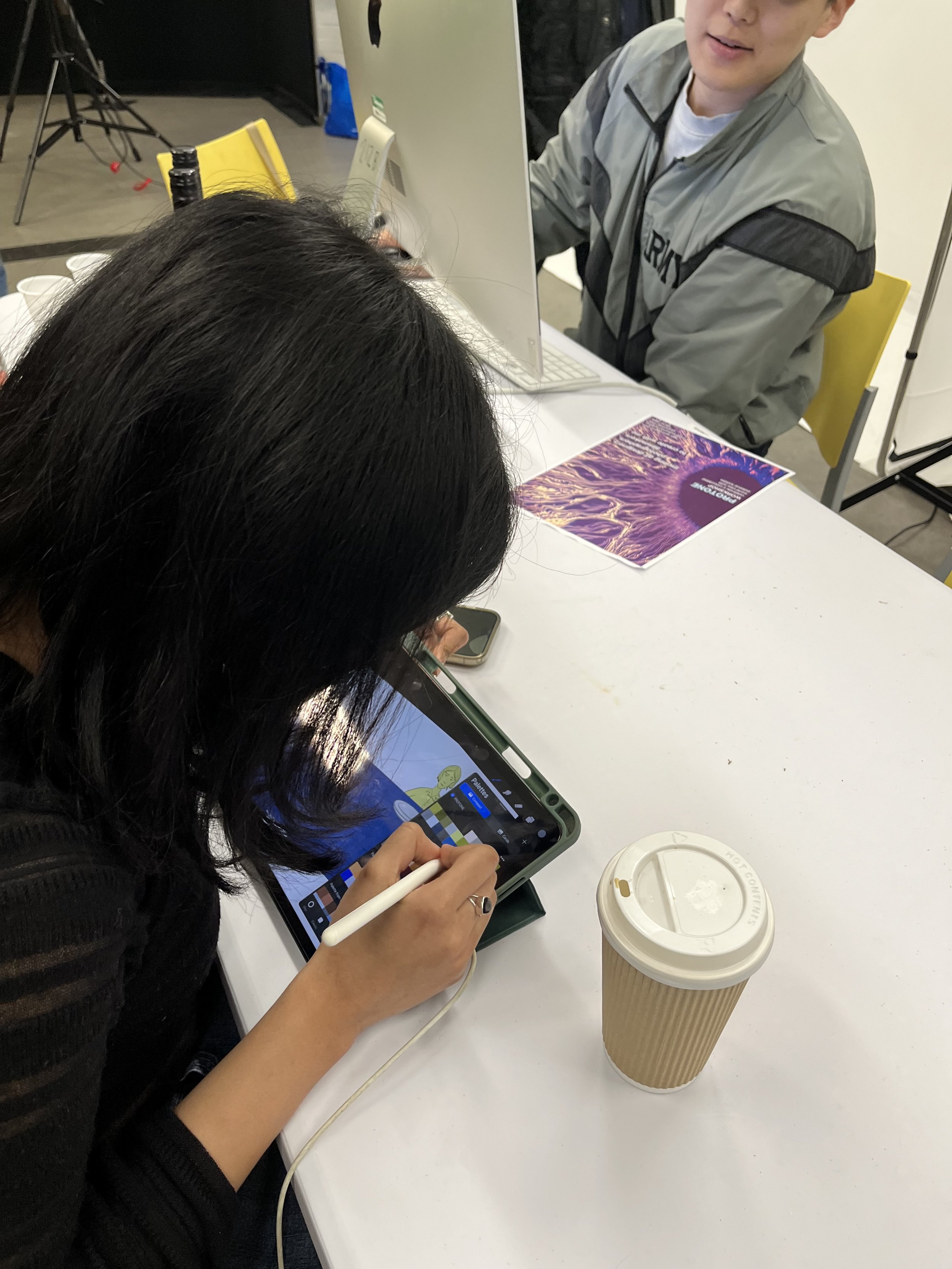
Use my protone palette on procreate.
Try to find more greens.
Be creative!
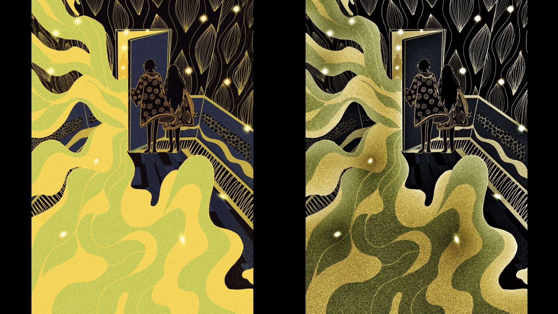
Art created by artists using PROTONE.
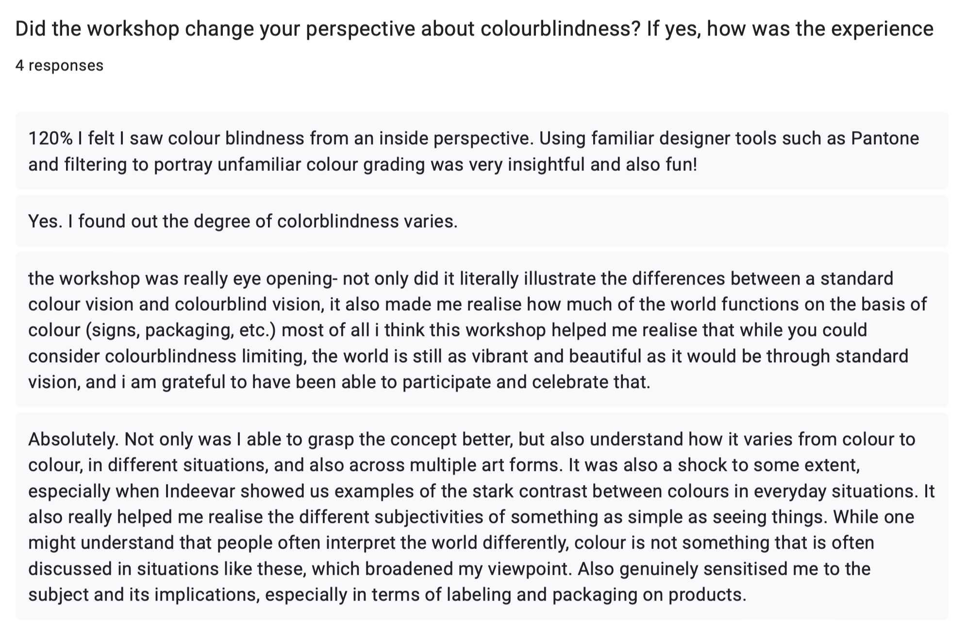
FEEDBACKS FROM THE WORKSHOP


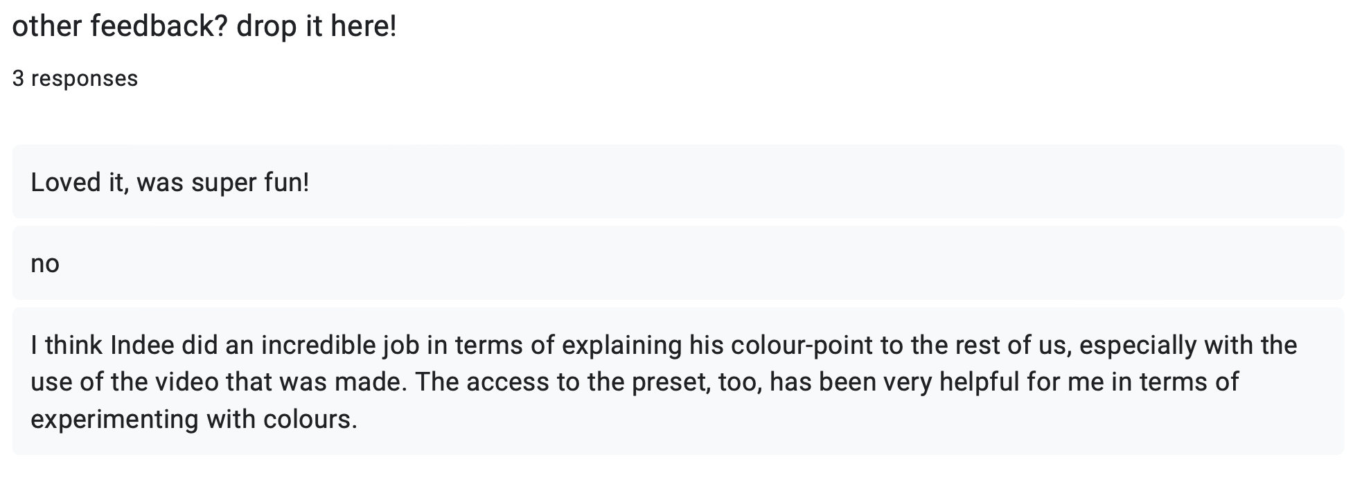

Thank you Udhav Arora and Ashika Miriyam for being the “normal” colour vision for this project.
thank you Advita Singh for coming up with the name “PROTONE”
Couldn’t have done it without them.